welcome to in a card's blog...
i know that "cute" is not a word typically used to describe good design, but in my world, it is. if it's your first reaction to say, "aww... how cute!" then it must be just that! "C-U-T-E." and i'm talking about so incredibly, ridiculously cute that the most masculine of men will even say those three words without thinking twice about it.
and so that is what i hope to share with you on my blog...
a combination of really unique ideas, simple thoughts that come randomly into my mind, along with "cute" designs that i've designed or come across.
chloe, from
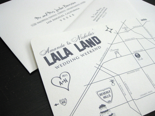
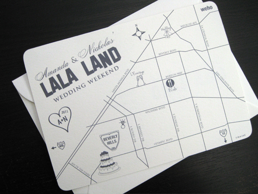
Chlo+E, has been helping plan for her brother nicholas and soon to be sister in law, amanda's upcoming wedding weekend of fun. first on her list is a fun wedding weekend invitation to the guests announcing all the different festivities that is going to take place before and after the actual wedding day. many of the guests are coming in from out of town so the fun theme of the "lala land wedding weekend" is very appropriate. they decided it would be fun to incorporate a fun map into the invite pin pointing the different locations each festivity is going to take place at. here's a look at the finished piece...
sherry and i went to high school together and reconnected this past year on facebook. it was such a wonderful surprise when she contacted me in regards to designing her wedding invitations.
before i start talking about the wedding invitation, here are a couple things that i remember most about sherry from high school... sherry was my biology partner in mr. mclaughlin's class, sherry's older brother was and still is a really good friend of my older sister, sherry loved to write poetry and based on the few that she shared with me, i remember thinking that she is a true romantic. and after all these years, i believe she still is and has found the love of her life, michael.
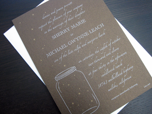
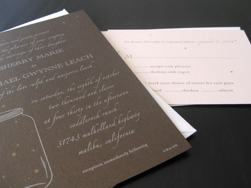
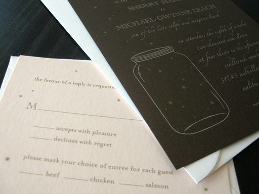
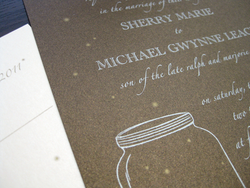
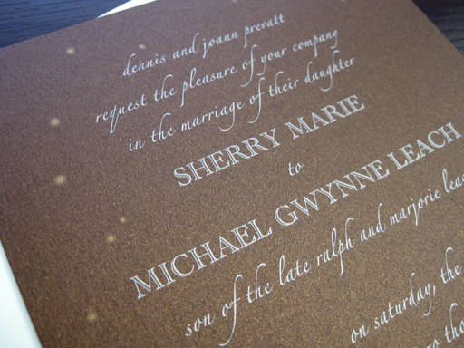
sherry and michael came to me with a very distinct style and vision for their wedding invitation. they're wedding is set to be outdoors at a ranch/winery. the elements they wanted to incorporate were a whimsical feel with fireflies, mason jars and their wedding colors, dark chocolate and a pale blush pink. they liked the idea of iridescent or shimmery paper but still wanted to keep it simple with just the invitation and reply card.
all they had to say was "iridescent or shimmery paper" and my heart had melted. i knew that these invitations were going to be very fun and different then anything else i had ever done.
the finished piece consists of a dark chocolate metallic cardstock printed with 2 metallic inks, silver and gold. since the reply card needed to be a lighter color so that guests could write in their response, we decided to go with a very pale blush pink metallic cardstock incorporating the second color of their wedding.
congratulations to sherry & michael on your up and coming wedding and your new life together!
it's been a busy year of weddings so far this year! my next few posts will showcase a few of the wedding invitations i've had the pleasure of designing recently. as always, it truly is an honor to be a part of announcing such a special day in two people's lives.
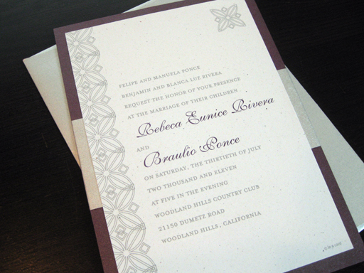
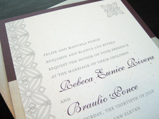
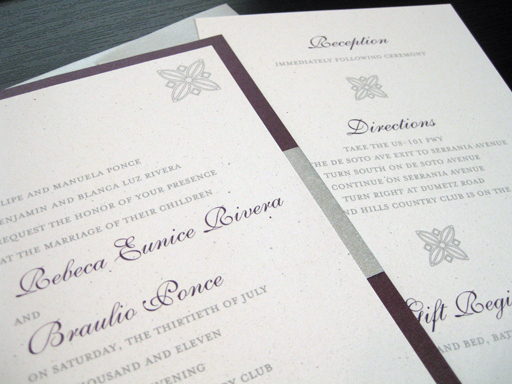
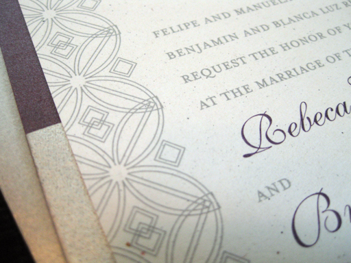
rebeca & braulio really liked the style and elegance of kari & michael's, "
endless love", wedding invitations i designed several years ago, so their invitation follows a very similar layout. however, since all of my invitations are always custom made to order to compliment the bride & groom, i created a custom pattern and motif, used throughout the invitation, that i felt represented both rebeca & braulio.
copyright
© in a card | all rights reserved